Contest to replace phpbb logo
Moderators: Kup, Ultra Magnus
-
Razorclaw
- Predacon Commander
- Posts: 1078
- Joined: Wed Jun 27, 2007 4:52 am
- Location: Behind you, ready to chop your head with my sonic sword...
Contest to replace phpbb logo
Trance wants to replace the phpbb logo and suggested any TFL member who wishes to,to create an artwork/picture and post it here in order to decide which will he use.
Far over the Misty Mountains cold, To dungeons deep and caverns old. The pines were roaring on the height, The winds were moaning in the night, The fire was red, it flaming spread, The trees like torches blazed with light.
-
Rumble
- Decepticon Demolitions Expert
- Posts: 1884
- Joined: Thu Jul 26, 2007 12:51 pm
- Location: Micro-Cassette Recorder
One entry:
Will probably do some more tho.
Rumble.
EDIT: Going with what Rodimus says further down, I have added a border to make it feel like it belongs on the page a bit more.
Rumble.
Will probably do some more tho.
Rumble.
EDIT: Going with what Rodimus says further down, I have added a border to make it feel like it belongs on the page a bit more.
Rumble.
Last edited by Rumble on Mon Jan 14, 2008 5:05 pm, edited 1 time in total.
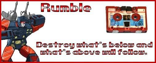
R.I.P, Menasor.
I can't believe I thought Cassettes were the way of the future.
Is +1 on Kups list.
'Cons Have More Fun

-
optimusprime
- Gestalt Team Leader
- Posts: 205
- Joined: Thu Oct 25, 2007 5:12 pm
- Location: cybertron
- Contact:
cool it should help look the forums look alot better to, more pro looking good idea trance and nice job on rumble
we are all a little wiser, from the knowledge we accumulate from this moment on, the return of optimusprime

http://www.tfarchive.org/portal/
http://www.tfarchive.org/portal/
-
optimusprime
- Gestalt Team Leader
- Posts: 205
- Joined: Thu Oct 25, 2007 5:12 pm
- Location: cybertron
- Contact:
looks great trance thank u for doin that 
we are all a little wiser, from the knowledge we accumulate from this moment on, the return of optimusprime
http://www.tfarchive.org/portal/
http://www.tfarchive.org/portal/
-
Bumblebee

- Espionage Recon Leader
- Posts: 2053
- Joined: Sun Sep 09, 2007 11:03 pm
- Location: moonbase two
looks good guys cant wait to see what you come up with next rumble

To know others you must know yourself first!
The bigger they are the bigger thud they make when they fall!!!
http://www.transformerland.com/forum/vi ... 9520#89520
-
Rodimus Prime
- Custom Rank 4 U! Ask an Admin!
- Posts: 1561
- Joined: Fri Jul 21, 2006 11:43 am
- Location: Autobot city, Earth
-
Rumble
- Decepticon Demolitions Expert
- Posts: 1884
- Joined: Thu Jul 26, 2007 12:51 pm
- Location: Micro-Cassette Recorder
Rodimus I look forward to seeing what ideas you have. I get what you are saying about the background, was thinking about blending it in somehow.
My next one for now tho:

Rumble.
EDIT: Edited first post to show improved first attempt.
My next one for now tho:
Rumble.
EDIT: Edited first post to show improved first attempt.
Last edited by Rumble on Mon Jan 14, 2008 5:06 pm, edited 2 times in total.
R.I.P, Menasor.
I can't believe I thought Cassettes were the way of the future.
Is +1 on Kups list.
'Cons Have More Fun
-
optimusprime
- Gestalt Team Leader
- Posts: 205
- Joined: Thu Oct 25, 2007 5:12 pm
- Location: cybertron
- Contact:
nice, it has a great cybertron feel somehow
we are all a little wiser, from the knowledge we accumulate from this moment on, the return of optimusprime
http://www.tfarchive.org/portal/
http://www.tfarchive.org/portal/
-
Rodimus Prime
- Custom Rank 4 U! Ask an Admin!
- Posts: 1561
- Joined: Fri Jul 21, 2006 11:43 am
- Location: Autobot city, Earth
excuse the crudeness of this 2 minute throw together, but this is what I had in mind.
something on a white background to blend in with the main white section of the board it resides in, also I thought it would look like Unicron is trying to tear up the boards.

suggestions are welcome. I rduced it drastically in size, I had it much larger. if we can have it a lil bigger I could make it larger and somewhat clearer. I tried to emulate the text type from the main logo at the top too. but again the size detracts from the colors.
something on a white background to blend in with the main white section of the board it resides in, also I thought it would look like Unicron is trying to tear up the boards.
suggestions are welcome. I rduced it drastically in size, I had it much larger. if we can have it a lil bigger I could make it larger and somewhat clearer. I tried to emulate the text type from the main logo at the top too. but again the size detracts from the colors.

-
optimusprime
- Gestalt Team Leader
- Posts: 205
- Joined: Thu Oct 25, 2007 5:12 pm
- Location: cybertron
- Contact:
well i hate to say it but i like the cons image better, dont throw anything heavy at me rodimus please 
i just like the home of cybertron on top
i just like the home of cybertron on top
we are all a little wiser, from the knowledge we accumulate from this moment on, the return of optimusprime
http://www.tfarchive.org/portal/
http://www.tfarchive.org/portal/

-
Bumblebee
- Espionage Recon Leader
- Posts: 2053
- Joined: Sun Sep 09, 2007 11:03 pm
- Location: moonbase two
hey rodumis how about one with primus and unicron facing each other?
To know others you must know yourself first!
The bigger they are the bigger thud they make when they fall!!!
http://www.transformerland.com/forum/vi ... 9520#89520
-
Time Traveller

- Father Time (Admin)
- Posts: 6470
- Joined: Mon Dec 29, 2003 1:12 am
- Location: 90482 Orcus
- Contact: