
TFL Banner
Moderators: Kup, Ultra Magnus
-
Time Traveller

- Father Time (Admin)
- Posts: 6470
- Joined: Mon Dec 29, 2003 1:12 am
- Location: 90482 Orcus
- Contact:
TFL Banner
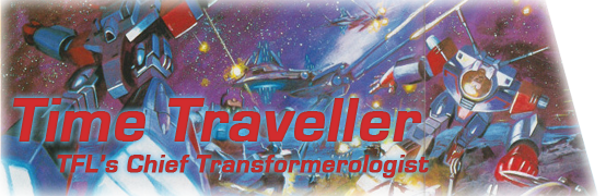
here ya go, guys, a rough banner idea. open to suggestions, needs tuning; and feel free to link to it for sigs and stuff.
-
Savanna RX-7 GT-X
- Custom Rank 4 U! Ask an Admin!
- Posts: 644
- Joined: Wed Jun 30, 2004 7:51 pm
-
Time Traveller
- Father Time (Admin)
- Posts: 6470
- Joined: Mon Dec 29, 2003 1:12 am
- Location: 90482 Orcus
- Contact:
-
Savanna RX-7 GT-X
- Custom Rank 4 U! Ask an Admin!
- Posts: 644
- Joined: Wed Jun 30, 2004 7:51 pm
-
Savanna RX-7 GT-X
- Custom Rank 4 U! Ask an Admin!
- Posts: 644
- Joined: Wed Jun 30, 2004 7:51 pm
Before you say anything, this is the first thing I have done in Photoshop CS, and its the first time in about a year I tried anything like this.
But I made thsi simple Banner to show what oyu might want to try.

I put a Black border on the whoel outside, then with the color theme I had going at the time(black and white, really basic lmao), I put a small White line inside the Black. I used the white line to mainly seperate the upper left box and hte lower right box. I then jstu used that black and white on the text that was selected, makign 2 of the same thing, giving it a shadow look. Nothing complex, and rather simple, but it has the essentials, shows what the site is for, and easy to read. If I had soem font fiels besides default, it woudl had looked better. Also, if it matters, I woudl drop the FOrums part unless its a direct link to the forums, but then agian you coudl drop the FORUMS text, or make it small and move it.
But I made thsi simple Banner to show what oyu might want to try.
I put a Black border on the whoel outside, then with the color theme I had going at the time(black and white, really basic lmao), I put a small White line inside the Black. I used the white line to mainly seperate the upper left box and hte lower right box. I then jstu used that black and white on the text that was selected, makign 2 of the same thing, giving it a shadow look. Nothing complex, and rather simple, but it has the essentials, shows what the site is for, and easy to read. If I had soem font fiels besides default, it woudl had looked better. Also, if it matters, I woudl drop the FOrums part unless its a direct link to the forums, but then agian you coudl drop the FORUMS text, or make it small and move it.

-
Aanallein
- Alternator
- Posts: 175
- Joined: Thu May 27, 2004 10:56 pm
- Location: Fargo, North Dakota, USA
- Contact:
Well... if I may. Yours is much better Savanna.
Sorry TT, but ya know. Gotta point out a fact. But still, the way the two images in the corners are... they offset. Blend them in more and have the same basic boarder shape. If you know what I mean.
Sorry TT, but ya know. Gotta point out a fact. But still, the way the two images in the corners are... they offset. Blend them in more and have the same basic boarder shape. If you know what I mean.

There is nothing more dreadful than imagination without taste. ~Wolfgang von Goethe
-
Savanna RX-7 GT-X
- Custom Rank 4 U! Ask an Admin!
- Posts: 644
- Joined: Wed Jun 30, 2004 7:51 pm